19 Ekim 2011 Çarşamba

C. Billadeau

When I first tumbled onto this image, I had no idea who C. Billadeau was. It kind of paralyzed me to see such accurate and beautiful representation of what I have been experiencing for a long time now during sleep, say for my whole life: Sleep paralysis.

Above illustration Entre Chien Et Loup literally translates into "between dog and wolf" and it connotes the particular moment between waking and sleeping, day and night, consciousness and unconsciousness, reality and hallucination.

Billadeau is a Minneapolis based illustrator whose interests entail comic art, bookbinding and printmaking as well. You can check out her many great works here.

5 Ekim 2011 Çarşamba

James Jean

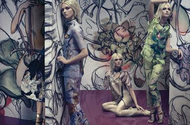
One of my all-time favorite (I mean like really, I adore the man) illustrators is James Jean. He is a Taiwanese-American illustrator known for both his fine art gallery works and commercial works. He is also responsible for cover works of various books published by DC Comics along with Prada, ESPN and Atlantic Records. I don't know how I got to know his works but I am pretty sure I've stumbled upon them sometime four years ago.


What I didn't know 'til just now that he collected much critical acclaim from advertising world with his Prada works he created in 2007 (see above). Check him and his works out by clicking on the links. Don't forget to visit his personal online gallery, you will not regret it!

Kinetic Typography

Combining text with animation is a sub-genre of typography called by some kinetic typography. Here is a list of various examples of it. We are actually kind of familiar with the concept because of those somewhat cliche facebook videos circulating around. And when given some thought, it seems easy for any graphic designer with After Effects skills to create an at least acceptable kinetic typography work. However, as anything else about design, it is not only about your technical skills but your capability to gather your ideas and reflect them as much as possible on your work. Similarly, in kinetic typography, the important thing for the designer is to capture the feel of their subject by adding those subtle tweaks.

4 Ekim 2011 Salı

Manifest

They say, one should come up with a witty manifesto for their blog to, you know, get BIG. It should stand for something. It shall not necessarily provide the brand new information or simply collect all, whatever is out there, no. It should question the faux pas status of the art work. The holy Wiki Father says "a faux pas is a violation of accepted social norms" (for example, standard customs or etiquette rules). Faux pas vary widely from culture to culture, and what is considered good manners in one culture can be considered a faux pas in another. Come to think about it, isn't it the same for an artwork as well?* On the other hand, the term faux pas comes originally from French, and literally means "misstep" or "false step". Don't you ever wonder how much of art is accidental?** Some guy named Scott Adams once said "Creativity is allowing yourself to make mistakes. Art is knowing which ones to keep." Well, I don't know about that. What I know is that this blog will hunt for the bizarre examples of contemporary art scene along with the tiny little tips and tricks, and bring them on for you.

*This one is not a rhetorical question.

**I admit that I stole this from a (brilliant) TV show.